Securityplus Federal Credit Union
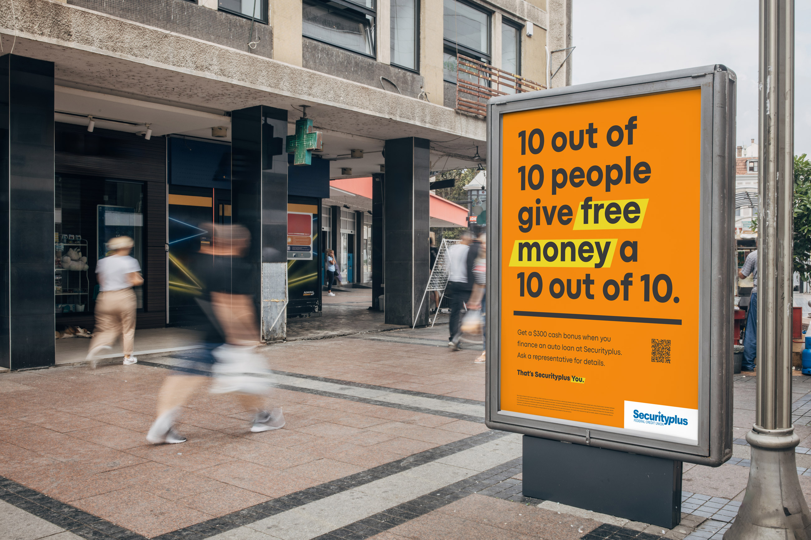
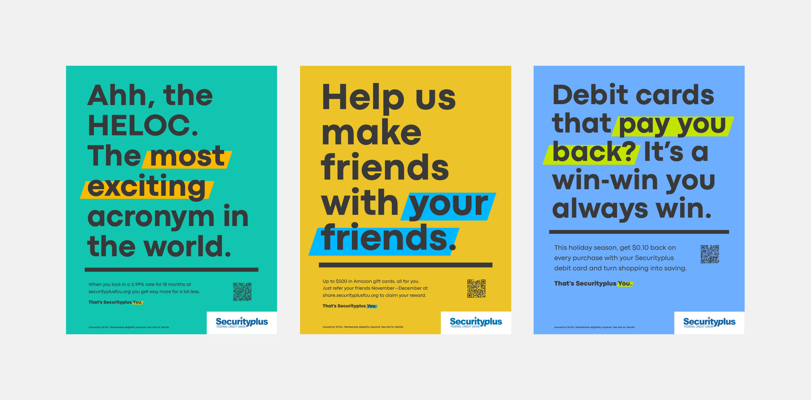
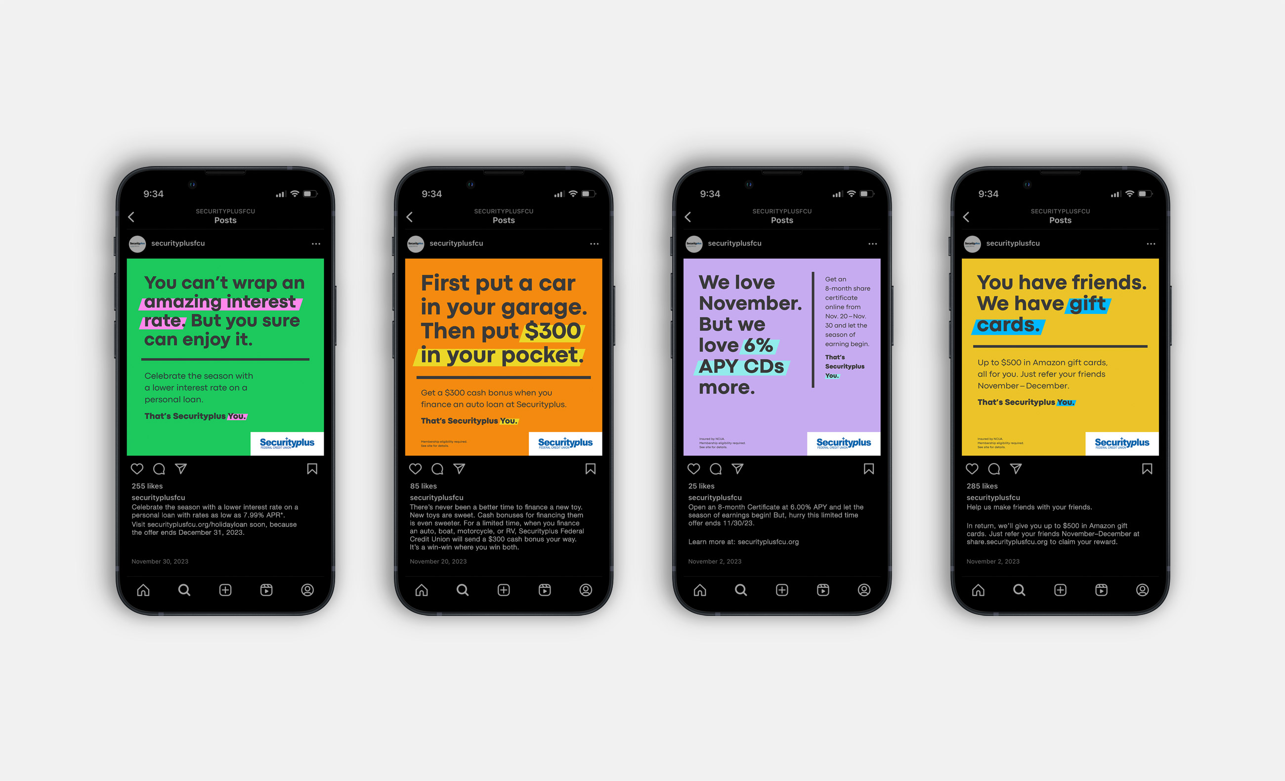
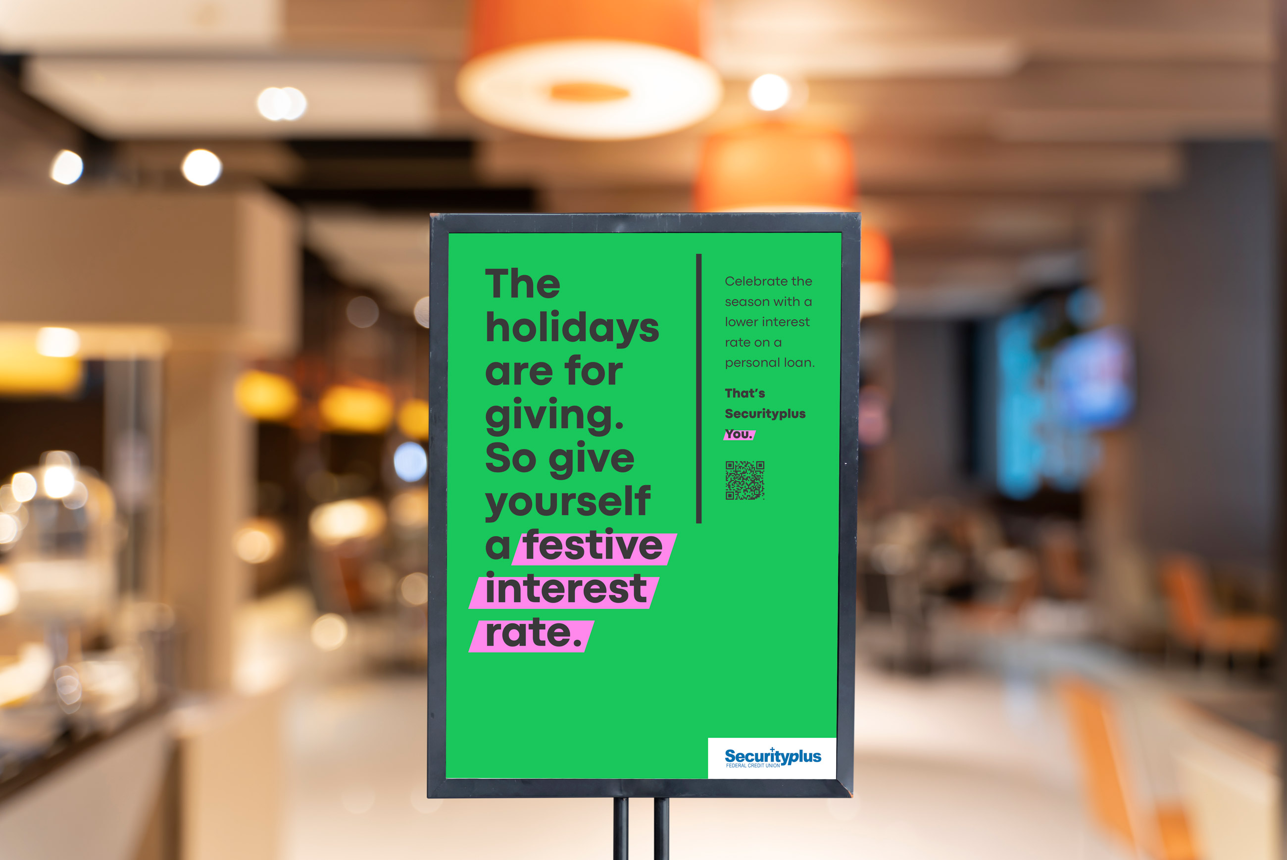
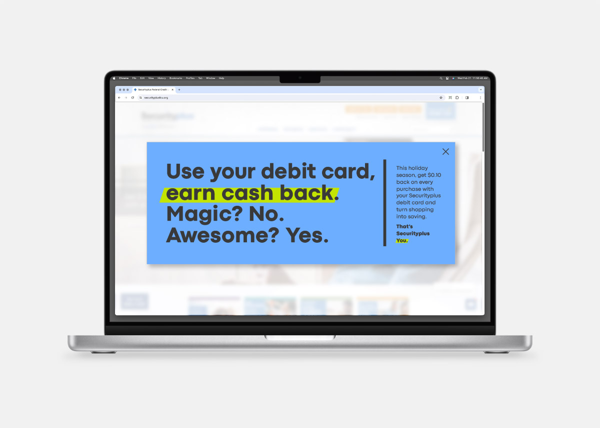
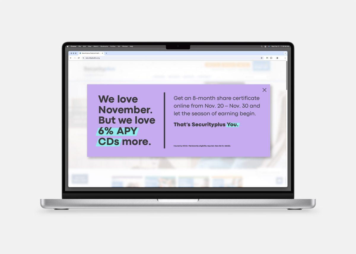
When you think of financial industry branding, you’d be forgiven to consider most of it less than flashy or fun. Well, our friends at Securityplus Federal Credit Union are out to throw a wrench in that perception. They recently came to us with a brief to develop a big, splashy campaign for a handful of holiday promotions, and chose a direction that is a polar opposite to what most financial brands put into the world. The work is bold, vibrant, cheeky, colorful, and has a lightness and playfulness you just don’t see every day. Which is kinda the whole point when you want to stand out.
This campaign cast a wide net in the digital space, out of home, in their branches, and a handful of delightfully animated films ran online across markets. All made possible with great clients with great taste and an appetite to stand out, have fun, and do work that works. ![]()